When you look at a ripe strawberry, is it truly red—or is that just your brain’s interpretation?
Surprisingly, colour does not exist outside our perception.
It’s a story our brain tells, based on light.
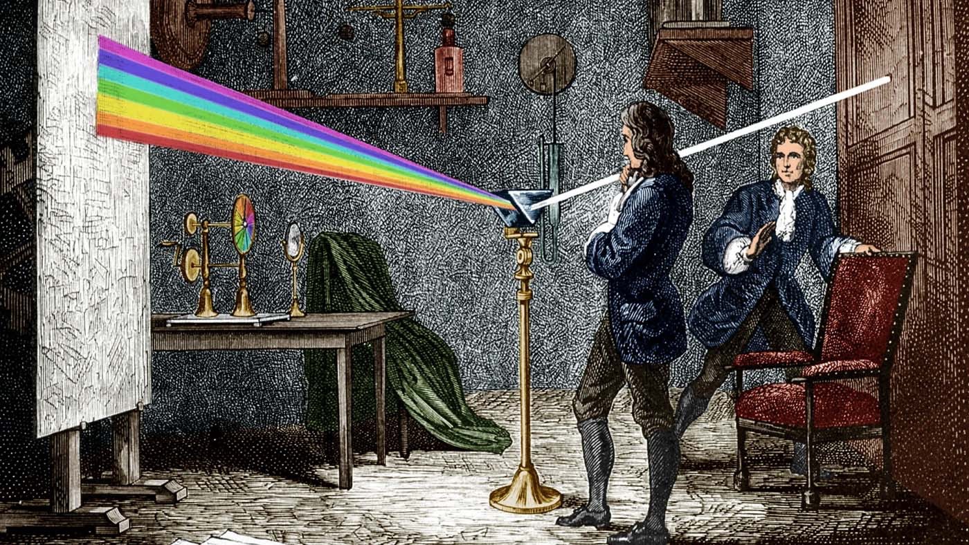
From a physics perspective, colour is simply electromagnetic radiation within a specific range of wavelengths—between roughly 400 and 700 nanometres—that the human eye can detect. This is known as the visible spectrum.

How We See Colour
When light strikes an object, some wavelengths are absorbed while others are reflected.
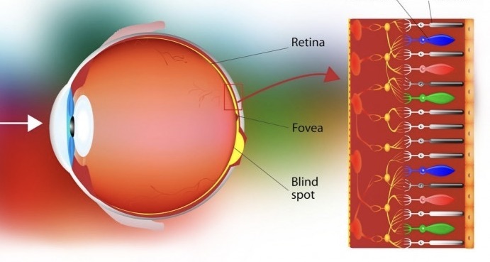
The reflected light enters the eye, passes through the cornea, pupil, and lens, and travels through the vitreous body to the retina.
Here, two types of photoreceptors—rods and cones—convert light into electrical signals:
- Rods: Work in low light, giving black-and-white vision.
- Cones: Detect colour and fine detail in bright conditions.
We have three types of cones:
- L-cones – long wavelengths (reds)
- M-cones – medium wavelengths (greens)
- S-cones – short wavelengths (blues)
Even with only three types, our brains can interpret around one million different shades.
These signals travel via the optic nerve to the brain’s visual centres, where they are assembled into the images—and colours—we experience.
Colour is not a property of objects; it’s a neural experience.
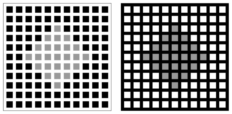
A striking example of how context shapes perception. In both images, the central colour patch is exactly the same, yet it appears different because of the contrasting backgrounds. This demonstrates that colour is not fixed in objects but constructed by the brain based on surrounding cues.
Context Shapes Colour
The same wavelengths can appear as different colours depending on lighting, surfaces, and context.
- A white wall under red lighting will look pink.
- In the Bressan’s Dungeon illusion, identical colours appear different when surrounded by contrasting backgrounds.
This shows that colour is a construction of the brain, not a fixed reality.
Neuroarchitecture and colour
Since colour exists only in perception, its role in neuroarchitecture is about shaping experience, not simply picking paint samples.
Strategic use of colour can:
- Modulate mood and arousal – energising or calming occupants.
- Aid wayfinding – improving navigation and memory.
- Alter spatial perception – making spaces feel larger, smaller, warmer, or cooler.
- Adapt to sensory needs – preventing overload or providing stimulation.
Designers work with the experience of colour to support wellbeing, function, and emotional connection.
Colour blindness, or colour vision deficiency (CVD), is not just a lack of colour; it’s how the brain processes certain light wavelengths differently because of changes in retinal cones. People with CVD can still see colours, but their ability to differentiate certain shades—especially reds and greens, or less often blues and yellows—is affected.
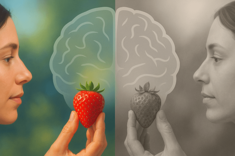
Comparison showing how a person with typical colour vision and someone with achromatopsia perceive the same scene. In achromatopsia, the absence or malfunction of retinal cones means the world appears only in shades of grey, with no colour information, often accompanied by light sensitivity and reduced visual acuity.ne with colour-blindness.
When the Brain Sees Colour Differently: Colour Blindness
Not everyone perceives colour in the same way.
In colour vision deficiency (CVD)—commonly called colour blindness—the cones in the retina send altered signals to the brain, changing how hues are interpreted.
Most CVD cases involve difficulty distinguishing reds and greens.
Rarer types affect blues or, in achromatopsia, remove colour vision entirely.
Contrary to popular belief, most colour-blind individuals do not see the world in black and white—only in a shifted or reduced palette.


The same scene as perceived by a person with typical colour vision and by someone with tritanopia, a rare form of colour blindness that reduces sensitivity to blue light, shifting and dulling blues and yellows.
Image from Colour Awareness Org


A side-by-side comparison showing how a person with typical colour vision and someone with protanopia perceive the same scene. In protanopia, the absence of L-cones reduces sensitivity to red light, causing reds to appear darker and greens to shift toward beige or greyish tones.
Image from Colour Awareness Org
How Common Is It?
- 8% of men and 0.5% of women worldwide.
- The Most common type is inherited via the X chromosome, explaining higher prevalence in men.
- In practice: at least 1 in 12 men and 1 in 200 women in any large group will have altered colour perception.
Design Implications
Since colour is a matter of perception—and not everyone perceives it in the same way—its role in design should be considered in greater depth. For example, in cases of colour blindness, if a design relies solely on colour, some users may become disoriented or be unable to access information.
This is why it is essential to combine colour with other resources such as patterns, textures, symbols, and strong light–dark contrast, ensuring that orientation, signage, and instructions are understandable to everyone
Use:
- Patterns, textures, or symbols alongside colour.
- Light–dark contrast instead of hue alone.
- Colour blindness simulators to test accessibility of palettes.

Example: Traffic Lights and Colour Blindness
For most people, the red, yellow, and green of a traffic light are instantly recognisable. But for someone with red–green colour blindness—the most common type—these hues can be difficult to distinguish, especially at a distance or in low light.
Instead of perceiving a bright red at the top and a vivid green at the bottom, they might see two similar shades of yellowish-brown, relying on position (top, middle, bottom) or brightness to tell them apart.
This is why inclusive design in road signage does not rely on colour alone: many countries standardise vertical arrangement, shape, and light intensity so that meaning is clear for all users, regardless of their colour perception.
Colour isn’t in the walls—it’s in the mind.
The designer’s role is to create conditions where that perception supports mood, function, and inclusivity.
Final Reflections
Colour in Neuroarchitecture
- Exists only as a perception in the brain.
- Shapes mood, behaviour, and wellbeing.
- Must be inclusive, considering variations in visual perception like colour blindness.
- Works best when combined with contrast, texture, and light for clear communication.
References
BrainFacts.org. (2012, July 2). Vision: Color perception. Society for Neuroscience. https://www.brainfacts.org/thinking-sensing-and-behaving/vision/2012/vision-color-perception
Bressan, P. (2001). Explaining lightness illusions. Perception, 30(9), 1031–1046. https://doi.org/10.1068/p3125
Cole, B. L. (2004). The handicap of abnormal colour vision. Clinical and Experimental Optometry, 87(4–5), 258–275. https://doi.org/10.1111/j.1444-0938.2004.tb05056.x
Derrington, A. M., Krauskopf, J., & Lennie, P. (1984). Chromatic mechanisms in lateral geniculate nucleus of macaque. The Journal of Physiology, 357, 241–265. https://doi.org/10.1113/jphysiol.1984.sp015499
National Eye Institute. (2020, August). Facts about color blindness. U.S. Department of Health and Human Services. https://www.nei.nih.gov/learn-about-eye-health/eye-conditions-and-diseases/color-blindness
Stockman, A., & Brainard, D. H. (2010). Color vision mechanisms. In M. Bass (Ed.), The optical society of America handbook of optics (3rd ed., Vol. 3, pp. 11.1–11.104). McGraw-Hill.
Witzel, C., & Gegenfurtner, K. R. (2018). Color perception: Objects, constancy, and categories. Annual Review of Vision Science, 4, 475–499. https://doi.org/10.1146/annurev-vision-091517-034231
About Colour Blindness. https://www.colourblindawareness.org/colour-blindness/#:~:text=Colour%20(color)%20blindness%20(colour,and%201%20in%20200%20women.
