Buying is rarely a neutral act. Even before you see a product or step into a shop —whether physical or online— your brain has already been activated by carefully crafted signals in advertising, branding, and marketing.
In physical spaces, this language becomes even more powerful: fragrances that lower your guard, warm lighting that promises reward, musical rhythms that slow your pace. Every element is designed to trigger mechanisms of perception, memory, and decision-making that neuroscience has helped us understand.

The origins of neuromarketing: Neuroscience and consumer behaviour
The term neuromarketing was coined in 2002 by the Dutch professor Ale Smidts, although its scientific foundations began to take shape in the 1990s with the use of fMRI and EEG to study how the brain responds to commercial stimuli.
These studies showed that purchasing decisions do not rely solely on logic: they also involve deep networks linked to emotion, memory, desire, and reward. This understanding opened the door to designing experiences based on real neurophysiological data, rather than intuition or marketing trends.
How does neuromarketing work?
The purpose of neuromarketing is to identify which sensory stimuli influence attention, preference, and purchasing decisions. This is achieved through neuroscientific tools that measure emotional changes, attention patterns, physiological responses, or levels of brain activation when exposed to different stimuli.
The process is straightforward:
- people are exposed to a stimulus;
- their responses are measured (ocular, emotional, physiological, or neural);
- the data are analysed;
- the findings are translated into strategies to optimise campaigns, products, and spatial experiences.
This is why so many brands now apply sensory principles in their physical shops.

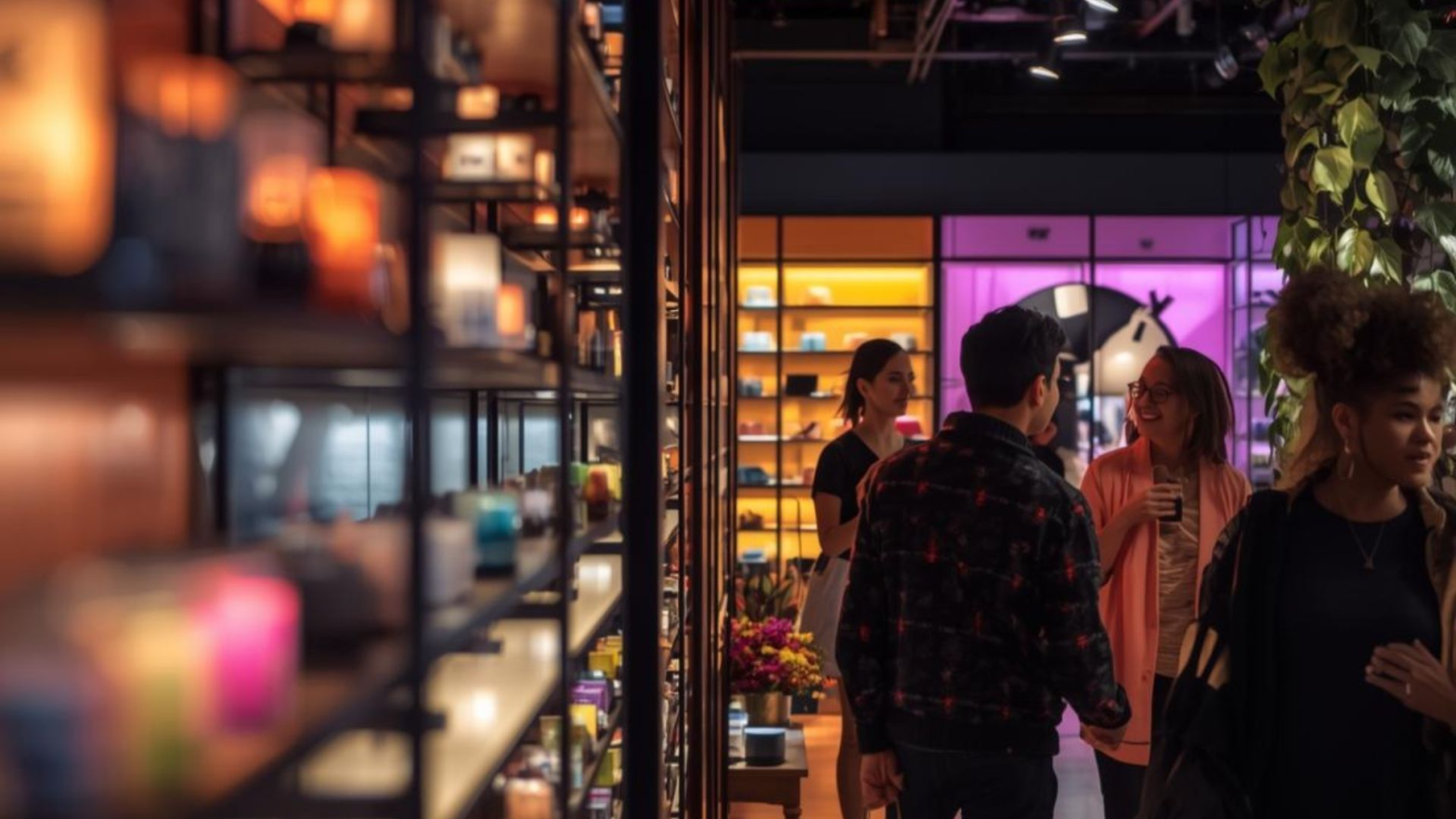
1. Aromas that regulate emotional state and extend dwell time
Smell is the most primitive sense and the one most closely linked to memory and emotion. This is why so many retailers use strategic scents: citrus notes to create dynamism, sweet notes to promote calm, woody tones to convey sophistication. The product matters, but the emotion it evokes matters even more.
2. Colour as a modulator of value, price, and sensory perception
Colours act as cognitive shortcuts: red triggers urgency, blue conveys trust, black signals exclusivity, and green suggests wellbeing. In shops, these palettes shape price perception, create emotional identity, and draw attention to strategic areas. Colour defines how a space feels long before we can put it into words.
3. Music as an invisible guide for movement and time
Musical tempo influences walking speed, time perception, and levels of activation. Slow music invites exploration, while faster rhythms accelerate decision-making. Every shop has a soundtrack, and it is never accidental: it forms part of the space’s emotional script.
4. Micro sensory rewards: architecture that releases dopamine
Well-designed shops apply a simple principle: if a space makes you feel good at every step, you stay longer… and buy more. This happens through micro sensory rewards: small, almost imperceptible stimuli —a light that highlights an object, a warm texture, a soft material, a relaxing curve, a polished surface— that produce subtle sensations of pleasure and comfort.
Each stimulus triggers a tiny reward response in the brain and, as they accumulate, they create an enjoyable journey that naturally encourages you to keep looking, touching, and exploring.
5. The sense of urgency and the fear of missing out — FOMO
FOMO —the Fear of Missing Out— captures that rush of anxiety we feel when we believe we might miss something valuable or unrepeatable. Retailers know this well. Many combine the illusion of an extraordinary bargain with a heightened sensory environment designed to intensify that urgency.
Black Friday takes this to the extreme. Signage in bold colours, limited-time offers, visual noise, louder music and quicker foot traffic all work together to reduce reflection and push the brain towards rapid, automatic decisions. When overstimulated, the mind often chooses impulsivity as a form of relief: buying becomes a quick escape from the pressure created by the environment.
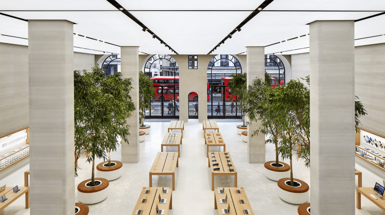
A space designed to lower cognitive load and heighten desire. The overhead lighting floods the room with natural clarity, the warm wooden tables invite touch and exploration, and the products are displayed like museum pieces, each one precisely illuminated to trigger subtle visual rewards. Absolute order, clean lines and open circulation create a sense of calm that encourages visitors to stay longer. Here, every spatial gesture —light, materiality, symmetry and full accessibility— is crafted to guide attention and make purchasing decisions feel effortless.
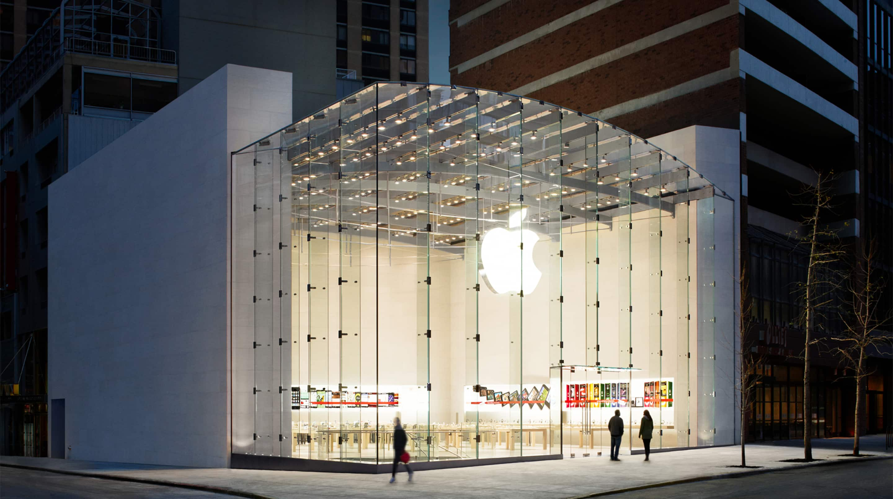
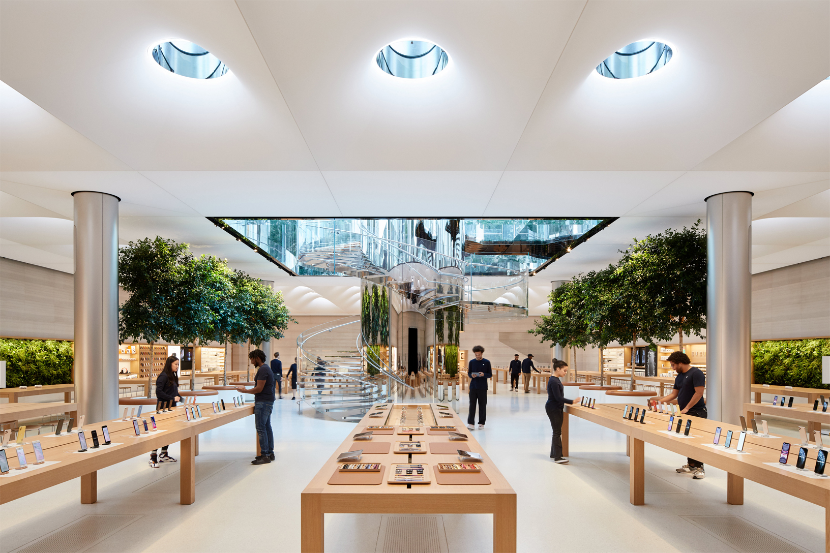

Apple: One of the strongest examples of physical retail and neuromarketing
Let’s take Apple Stores as a starting point. They are a masterclass in how consumer psychology and neuromarketing can be applied to the retail environment.
Their design is anything but accidental. It is the result of a meticulous strategy aimed at creating a deep, subconscious emotional connection with customers, reducing cognitive load and maximising the sensory experience.
Minimalist Design and Reduced Cognitive Load:
Apple Stores are spacious, orderly, and minimalist. This reduces visual clutter and information overload, allowing the customer’s brain to focus exclusively on the products. The result is a sense of calm, clarity and quiet luxury.
Sensory Marketing and Tactile Experience:
Apple actively encourages customers to touch, test and interact with their devices. The tactile experience creates a more connected, embodied interaction, helping customers subconsciously evaluate quality and functionality, and easing the decision-making process.
Premium Lighting and Materials:
Bright, precise lighting and the use of high-end materials (wood, glass, stone) activate the brain’s reward system, associating the brand with sophistication, value and premium quality.
No Sales Pressure:
Staff —known as “Geniuses”— do not work on commission, reducing pressure and fostering trust. This makes the visit feel more like meeting a knowledgeable friend than entering a sales environment, building long-term loyalty.
Brand Evangelism:
Through these carefully crafted experiences, Apple has created a community of highly loyal followers —almost “devotees”— who act as brand ambassadors. It’s a neural connection that makes them remarkably resistant to competing brands.
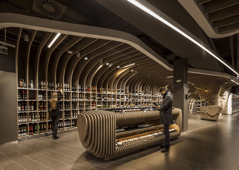
The wooden rib structure creates a warm, enveloping space that naturally guides the eye, while the linear lighting highlights the colours, shapes and textures of the bottles. The central display, designed with the same organic curve, invites both tactile and visual exploration.
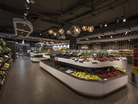
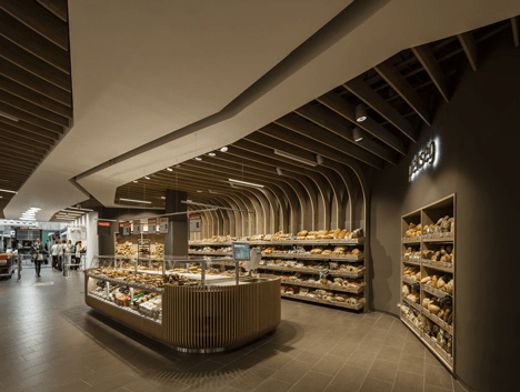
The design transforms everyday shopping into a sensory experience. The fruit and vegetable islands, warmly lit and surrounded by natural materials, create an immediate impression of freshness and wellbeing, while the bakery —with its enveloping geometry and the aroma of freshly baked bread— triggers emotional responses that encourage customers to linger.
Neuromarketing in Supermarkets: Key Points
The aroma of freshly baked bread
This is one of the most effective olfactory tactics in neuromarketing. Many supermarkets bake bread several times a day —or diffuse the scent artificially during peak hours— to activate brain areas associated with hunger and reward, increasing appetite and driving impulsive purchases of complementary products. This simple stimulus can turn a quick visit into a longer, more emotional shopping journey.
The designed route (directed flow)
In supermarkets, nothing is left to chance: the layout is carefully planned to increase dwell time and maximise exposure to products. Fruit and vegetables are placed at the entrance to create an impression of freshness; essential items are stored at the back to encourage customers to walk through the entire shop; and zigzagging aisles promote exploration and unplanned purchases.
Customers do not follow this route out of necessity —they follow it because the space is intentionally designed to guide their attention step by step.

This luxury department store is a prime example of how retail transforms shopfronts into sensory experiences. The large-scale floral compositions blend art, colour and movement to capture attention from the street and evoke an immediate emotional response. Selfridges is renowned for turning its windows into artistic installations that function as immersive marketing.


Authentic artistic installations where luxury is communicated through detail. The staging combines craftsmanship, iconic objects and visual storytelling that link the brand to a sense of exclusivity and fantasy. As a world-famous department store, Harrods attracts visitors not only with its architecture and exterior lighting but also with these vitrines, which function as micro-museums: spaces where art, storytelling and branding merge to capture attention and evoke an emotional response even before stepping inside.
Conclusion: Do we choose… or are we chosen?
We are not neutral consumers: we are sensitive brains moving through environments that speak to us without words. Every colour, every scent, every texture and every beam of light is placed there to influence —to a small or significant degree— how we feel, what we think and what we decide.
Commercial neuroarchitecture is not a trick or disguised manipulation; it is the recognition that our minds respond deeply to sensory stimuli, and that the spaces we inhabit can support us or push us, calm us or activate us, open us to curiosity or steer us towards impulsive buying.
Understanding these dynamics not only makes us more conscious consumers, but also more responsible designers. If we know how architecture shapes emotion, we can use that knowledge to create environments that are more ethical, more human, and less overwhelming.
Recommended Readings
Smidts, A. (2002). Looking into the brain: The use of fMRI for marketing research. Rotterdam School of Management.
Morin, C. (2011). Neuromarketing: The new science of consumer behavior. Society, 48(2), 131–135.
Spence, C. (2021). Sensehacking: How to Use the Power of Your Senses for Happier, Healthier Living. Penguin.
Milliman, R. E. (1982). Using background music to affect the behavior of supermarket shoppers. Journal of Marketing, 46(3), 86–91.
